How to include video in email: 5 ways to start driving results
Many marketers wonder how to embed video in email campaigns. The answer is, you shouldn’t.
According to CanIEmail, an authority on email client format support, 85% of inbox providers don’t support embedded video. Why? Because major inbox providers like Gmail, Apple Mail, and Outlook tend to view embedded content—surveys, forms, videos, widgets, etc.—as a security threat.
This means your videos won’t autoplay within an email, nor will they play at all inside an email app. If you send emails with embedded video code, two things are likely to happen:
- The email client will strip out the embedded code, and your recipients won’t see the video when they open the email.
- Your email will end up in junk folders, and your overall deliverability will plummet.
This is why reliable marketing automation platforms, like Klaviyo, don’t support embedded videos in emails—because they know how important it is to preserve email deliverability.
You may not be able to embed video in your emails, but there are several ways you can make sure people see them. Here’s a step-by-step guide to making clicking on a video in an email a no-brainer for your subscribers.
1. Find the right platform to host your videos
When you’re looking for a place to upload your video files, consider 3 things:
If email is only a slice of a larger video strategy, YouTube is best for SEO and overall discoverability. That said, if you’re creating videos specifically for social channels like TikTok or Instagram, make sure the videos you use in emails link back to those channels (or any landing pages on which you’re hosting that content) so that you can measure engagement properly there.
If you want to use analytics to build or optimise a larger video strategy, choose a platform that will give you access to metrics on video views, watch time, average view duration, and audience retention. Remember, there are nuances here. Note, for example, that if you upload a video to YouTube and then need to swap it for another version, you lose the URL and all analytics for that video. With Vimeo, you can swap out the video and retain the original video URL with analytics.
If you want to customise your videos’ brand colours or password-protect videos for exclusive access, this is when you may want to consider Vimeo or Wistia over YouTube.
| YouTube | Vimeo | Wistia | TikTok | ||
| SEO/discoverability | ✅ | ❌ | ❌ | ✅ | ✅ |
| Advanced analytics | ✅ | 💰 | 💰 | ❌ | ❌ |
| Custom player colours | ❌ | ✅ | ✅ | ❌ | ❌ |
| Password protection | ❌ | ✅ | ✅ | ❌ | ❌ |
| Call-to-action buttons and cards | ✅ | ✅ | ✅ | On ads only | On ads only |
| Storage capacity | Unlimited | 💰 | 💰 | Unlimited | Unlimited |
| Pre-roll ads before your video | ✅ | ❌ | ❌ | ❌ | ❌ |
| Video editing features | ❌ | ✅ | ❌ | ✅ | ✅ |
2. Choose where viewers should watch the video
Your hosting platform isn’t the same as your landing page.
Let’s say you’ve chosen YouTube as your hosting platform. That doesn’t mean you’re sending people to YouTube from your emails to watch your video. You can instead embed the YouTube video file on your website, then send the recipient there.
This is true for all hosting platforms mentioned so far, including TikTok, Instagram, Wistia, and Vimeo.
We recommend sending people to your website to watch your videos for a few reasons:
- You own your website, so you control the user experience.
- Your video analytics will integrate well with your website analytics.
- You’ll encourage viewers to browse your website and take additional actions—increasing the likelihood shoppers will convert.
- You can feed website data into your paid media retargeting strategy, so that folks who have seen specific videos don’t get served with the same one again, and again, and again.
Your choice of website landing page depends on the type of video you’re promoting. Here are some examples:
- Product how-to → Product page
- Brand story → About us page
- Customer reviews → Homepage
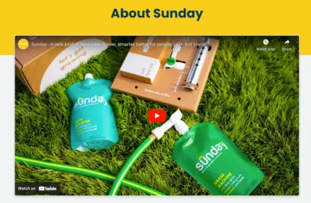
Check out this example from lawn care brand Sunday. You can clearly see the full video is hosted on YouTube, but it’s embedded at the top of their About Us page.

The video is the first thing Sunday wants people to see when they’re learning about the brand.
3. Style your video graphic to encourage clicks
Now that you know where you’re sending people, it’s time to increase the likelihood they’ll get there from your emails.
Here are a few ways to encourage a click, without actually embedding a video in your email:
Use a static image that looks like a YouTube thumbnail
YouTube creators are obsessed with video thumbnails, and for good reason.
The overwhelming majority of top-performing creators on YouTube use custom thumbnail images, meaning they aren’t using the options YouTube generates for them—they’re creating thumbnails themselves based on some tested best practices:
- High-contrast images
- Adding arrows, circles, and other graphics to images
- Bright colours
- Text overlays
- Faces in images
Treat your email thumbnails the same way and use image editing software (we recommend Photoshop, Pixlr, or Canva) to add a red play button for good measure. Everyone already recognizes YouTube’s play button, so you might as well lean in to the expectation to increase clicks.
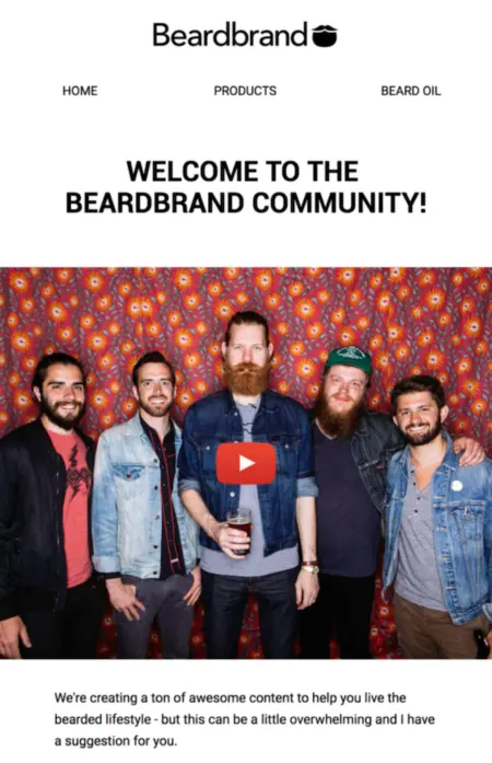
Check out this example from men’s grooming brand Beardbrand, which combines thumbnail best practices with a YouTube play button to entice people to click on the image.

Make an animated gif
An animated gif is a moving image that repeats itself on a loop. It’s more eye-catching than a still shot, but inbox providers support the format because they consider it a moving image rather than a video.
Use one that gives people a preview of the video you want them to watch. Returning to our Sunday example from earlier, the brand could choose to isolate this gif preview from their brand video and add a play button to encourage people to click:

To make a gif, we recommend using an app like GIF Brewery, EZgif.com, or Imgflip.com.
A word of caution: If your gif file size is too large, it will take too long to load in an email. Aim for a file size of 1MB or less.
Add a video link to your email copy
Your last option is adding a link to text—an approach that’s simple, uncomplicated, and effective with the right copy.
For example, if you’re pushing people to an educational video or product demo with clear steps to accomplish something, you can summarise each step in your email copy, then link out to the video with a call to action (CTA) at the end.
This is also the best route to take any time you’re attempting to include a video in a completely text-based email.
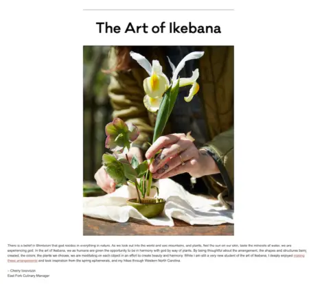
Here, East Fork Pottery embeds a video link in the text of their email, pointing readers to an Instagram video of their culinary manager building a flower arrangement.

4. Test and optimise options for future emails
Whether you choose a thumbnail or a gif, you won’t really know what works until you test it with your audience. This is why we recommend running a few A/B tests when you start pushing people to videos with email.
Here are a few examples of tests you can run to see which approach works best for your audience:
- Thumbnail A vs. thumbnail B
- Thumbnail vs. gif
- gif A vs. gif B
- Thumbnail vs. text
- Text A vs. text B
When you run your A/B test, you’ll need to choose a parameter to measure to determine success. For the purpose of testing what entices people to view your video, we recommend click rate.
With Klaviyo, you can customise your A/B test parameters by audience percentage and time. For example, you can choose to reserve 20% of your email recipients for variation A, and another 20% for variation B.
Depending on how many of your recipients click on the email, a winner is chosen after 6 hours—and the rest of the recipients automatically receive the winning variation.

5. Don’t forget about accessibility
Images that link to videos can introduce some busyness to otherwise clean design. It’s important to consider design accessibility considerations when, for example, including a play button on a video thumbnail image.
To make sure your emails remain accessible with the addition of a video image, make sure to:
- Add alt text to all images.
- Avoid putting pertinent information in images.
- Use contrasting colours.
Learn more about Klaviyo’s accessibility recommendations for email and forms.


