You’ve definitely heard of the abandoned cart email. But have you heard of the browse abandonment email?
As your brand grows and your email automations start to bring in revenue, a browse abandonment automation is the logical next step to capturing even more sales from your email marketing strategy. This is because browse abandonment emails intervene at a crucial point in the customer journey: product comparison and price shopping (more on that later).
Browse abandonment emails are one of the most effective ways to convert shoppers who have displayed interest in a certain product. According to Klaviyo data, browse abandonment emails have a 0.96% conversion rate—9.6x higher than the average email campaign.
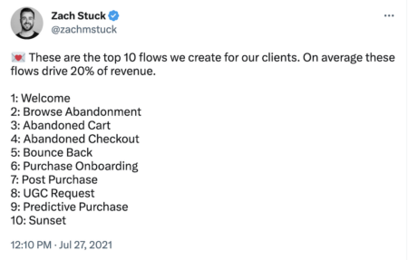
Also known as an abandoned browsing email, this oft-overlooked email automation might be one your competitors haven’t started using. Keep reading to find out how to get browse abandonment right—and give your brand that extra competitive edge it needs to increase revenue from email.
What are browse abandonment emails?
Browse abandonment emails are sent automatically to your website or online store visitors who left without making a purchase. These emails are designed to re-engage potential customers and encourage them to return and complete their purchase.
When you send a browse abandonment email, you’re nudging people to take a second look at the product on your website. Think of it as your second chance to encourage someone to buy, whether it’s through:
- Showing more benefits
- Comparing your product to a competitor
- Highlighting a customer testimonial
- Sending a special offer
The best part is that this type of email is automated, meaning you set it up once and let it run with your email automation software.
And because browse abandonment emails are triggered when a shopper takes a specific action on your ecommerce site (in this case, viewing a product page), the emails are both low lift and personalised to a shopper’s product interests.
Browse abandonment emails vs. cart abandonment emails: it’s all about intent
Browse abandonment emails are sent when an existing subscriber views a product on your website and doesn’t place an item in their shopping cart. Cart abandonment emails are sent after someone places an item in their shopping cart but doesn’t complete the purchase. For a deeper look at how to set up and optimise your abandoned cart emails, see our complete guide.
The biggest difference between browse abandonment and cart abandonment is buying intent. When someone places an item in a cart, that signals high intent to buy (even though they didn’t end up purchasing). When someone views a product page on your website, it’s akin to telling a store clerk, “Hey, I’m just browsing—I’m not sure if I want to buy just yet.”
What this means is that you have some room to play with your browse abandonment emails, with the goal of striking a “relevance jackpot” with someone who needs a nudge toward stronger intent.
As Ben Zettler, digital marketing and ecommerce consultant at Ben Zettler Digital, points out, “When done right, your browse abandonment flow can have just as much impact on your overall revenue as abandoned cart or check-out—particularly if you tend to have a high repeat purchase rate.”
Your browse abandonment flow can have just as much impact on your overall revenue as abandoned cart or check-out—particularly if you tend to have a high repeat purchase rate.
Why do brands need a browse abandonment automation?
Remember: Browse abandonment emails drive conversions at a rate of 0.96%, compared to the 0.10% conversion rate of the average email campaign.
While abandoned cart automated emails earn even higher conversion rates than browse abandonment flows—3.55%, on average—browse abandonment flows tend to earn higher open rates than abandoned cart emails, which suggests they’re particularly good at piquing shopper intrigue.
If your browse abandonment rate is high, these emails can recover a meaningful share of that lost revenue, especially for brands with large product catalogues or higher price points.
Brands of all sizes can benefit from a browse abandonment flow, and the set-up is simpler than you might expect. But here are 3 signs that yours may be especially ready for this automation:
You have a high number of SKUs: If your website offers a large selection of items, your buyer’s journey may be longer and require more nudging than others. And when you have a large selection of products across multiple categories, you can build a better browse abandonment recommendation engine that surfaces related, relevant product alternatives that might grab the shopper’s attention instead.
- You sell luxury or premium products: If your website sells high-ticket items, your potential customers are likely doing a lot of research before they buy. In this case, you’ll use a browse abandonment email to demonstrate the benefits and value of your specific product, perhaps in comparison to your competitors.
- You sell products that require education: If your hero product is new to the market or solves a complex problem for the customer, you may need an educational tool to nudge hesitant shoppers. In this case, you may want to use a browse abandonment email to send a how-to guide or highlight customer testimonials.
4 audience segments to target with browse abandonment emails
Beyond simply targeting subscribers who visited a product page and moved on, did you know you can segment your audience of abandoned shoppers even further to make your emails more relevant?
Customer-First Data™—the combination of zero- and first-party data—refers to information the customer hands over consensually. It’s also an essential component of audience segmentation, which is how brands split audiences into email lists based on purchasing trends, website activity, email engagement, and customer service interactions.
When you split audiences into niches like this, you increase the relevance of your marketing messages—and also the likelihood they’ll engage. Here are 4 audience segments to target with different browse abandonment messaging:
1. Shoppers who have never purchased
Their point of view
Subscribers who have never purchased are aware of your brand—but they’re probably comparing your brand to another. Shoppers who have never purchased from you are most likely to be comparison shopping and/or price shopping, especially if there are a lot of similar brands in your category.
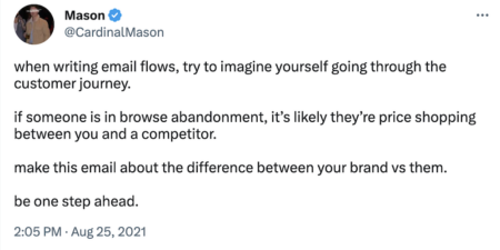
“Remember, the browse abandonment segment has the lowest buying intent among your database,” says Ashley Ismailovski, CRO operations manager at SmartSites. “Maybe they’re still shopping around for the best price, doing some research on the product, or just window shopping for the time being.”
For that reason, “hitting this segment with a discount code right off the bat may not be as effective as a link to a style quiz that helps match them to the perfect top for the event they have coming up next month, or an FAQ page that talks about your free returns and exchanges policy,” Ismailovski suggests.
Best messaging options
- Competitor comparisons
- Product benefits highlights
- Product education
- Coupon codes or discounts
- Information about your brand
2. One-time purchasers
Their point of view
One-time purchasers like you. They may just not love you yet. While one-time purchasers could still be reminded of the benefits of your product, they may require deeper knowledge of key features that might get them to buy again.
“Think about what the user did not see on your product detail page that caused them to hesitate and not add to cart,” suggests Alexa Engelhart, VP of client strategy at Power Digital Marketing.
Think about what the user did not see on your product detail page that caused them to hesitate and not add to cart.
Whether that’s information on ingredients, fit guides, use cases, or something else, Engelhart says, “add this content to your browse abandonment emails to overcome any potential objections and remove those hesitations.”
Best messaging options
- Product features highlights
- Deeper product education
- Cross-sell suggestions
- Coupon codes or discounts
- Loyalty program benefits
A word of caution
For customers who have only purchased from your brand once, pay attention to the recency of their purchase. For example, if a customer just placed an order from your ecommerce store, hold off on sending them browse abandonment emails for a month or two.
3. Loyal customers
Their point of view
Loyal customers already love you. They may not even need a browse abandonment sequence—but if you want to test one for converting this audience segment, you can keep it to a minimum.
Best messaging options
- Loyalty program points
- Newly released products
- Similar products
4. Shoppers who show repeated interest in the same product
Their point of view
Shoppers who have viewed a product page several times are showing higher purchase intent—still not as high as placing an item in a cart, but higher than the standard browse abandonment email would call for.
You may want to try nudging this segment toward a sale with urgency messaging, like saying either there are only a few items left or the discount you’re offering on that item is about to expire.
Best messaging options
- Sense of urgency: Urgency / limited-time offers
- Coupon codes or discounts
- Competitor comparisons
- Product benefits highlights
- Product education
The dos and don’ts of writing effective browse abandonment emails
How can you ensure your browse abandonment emails are a success?
Browse abandonment do’s
Always include the following:
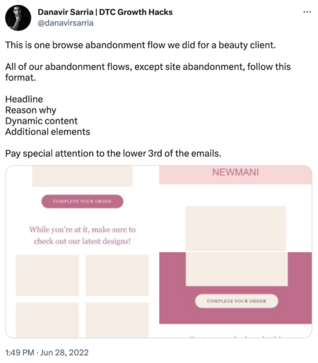
- Product image and description: Include an image and brief description of the product the shopper viewed. This reminder helps the shopper recall their interest and encourages them to complete their purchase.
- Clear call to action (CTA): A clear CTA should lead the customer back to their shopping cart or the product page. The CTA should be prominent, easy to find, and indicate the next steps the customer needs to take to complete their purchase.
- Persuasive messaging: Use persuasive messaging that conveys the benefits of the product. This could mean social proof (e.g., customer reviews),scarcity(e.g., limited stock or sale), or urgency (e.g., time-sensitive discount).
Browse abandonment don’ts
- Be too pushy: While it’s important to encourage shoppers to complete their purchase, they should also feel like they have a choice in whether or not to purchase the product.
- Be generic: A generic browse abandonment email that doesn’t acknowledge the customer’s browsing history comes off as impersonal—and will probably be less effective. Instead, personalise the email with segmentation and dynamic content.
- Go off-topic: Your browse abandonment emails should be easy to understand and relevant to the customer’s browsing history. Any extraneous information distracts from the message and lowers the chances of conversion.
Just looking: 5 browse abandonment email examples to get you started
If you need some inspiration for a variety of approaches you can take with your browse abandonment emails, here are 5 strong examples:
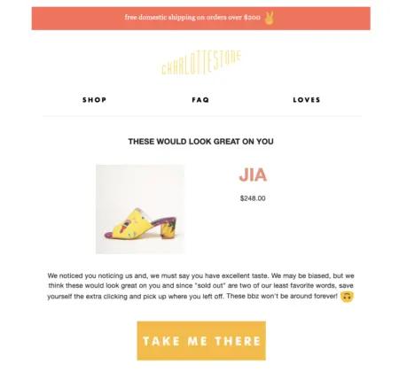
1. The humour approach: Charlotte Stone
Subject line
We noticed you noticing us…
Why this works
- The subject line is cheeky and approachable.
- The email copy compliments the recipient.
- The CTA drives shoppers back to the product page.
- The email closes with related product recommendations.
2. The education approach: Neptune

Why this works
- The email opens with a striking product image showing a benefit.
- The email copy reminds the shopper about the primary benefits: “easy breathability and extreme comfort.”
- The email copy educates the shopper on important features that might nudge them toward a sale: adjustable memory foam, aromatherapy pouch, etc.
- The CTA includes a discount code.
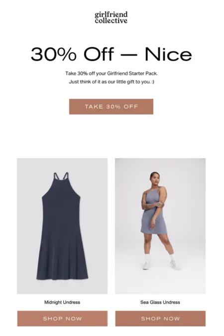
3. The discount approach: Girlfriend Collective
Subject line
Take another look + 30% off
Why this works
- The email opens with a discount code, enticing shoppers to take a second look.
- The email displays related product recommendations, which are also eligible to purchase with the discount code.
A word of caution: Be careful to avoid certain spam trigger words. Sometimes percentages, dollar signs, or other symbols and words that are associated with discounts can impact email deliverability. If you notice your emails are ending up in spam, this may be something to address across your email automation strategy.
4. The urgency + scarcity approach: Credo
Subject line
Get it before it’s gone

Why this works
- The subject line and headline convey urgency.
- The email opens with a free shipping offer.
- The email is personalised to loyal customers with an available points count.
- The email closes with a direct link to customer service.
This email does a great job exemplifying this advice from Brittany Rycroft, director of marketing at GhostRetail: “One of the top reasons shoppers abandon their purchase is because they simply can’t find what they’re looking for. If they get stuck in their shopping journey, offering live 1:1 video shopping support can be a great way to get them back on track.”
“Your live shopping associate can do the heavy lifting of helping them find what they need, while your customer feels well attended to,” Rycroft adds.
5. The limited availability approach: Sivana
Subject line
Your item is going fast!

Why this works
- The email subject line conveys limited availability.
- The headline reinforces urgency.
- The CTA insinuates the product might be gone soon.
Use browse abandonment emails to turn casual shoppers into intentional buyers
For many folks, window shopping online is a low-pressure activity they can do on their own schedule. But for marketers trying to bring in sales, browsing with no follow-up action is less than ideal.
Browse abandonment emails are a valuable tool for helping your subscribers, website visitors, and existing customers find their way back to your brand. They’re a friendly little nudge to coax your audience back to your online store.
Browse abandonment is just one of the email marketing automations you should have running behind the scenes. Once it is live, layer in other flows to cover the full customer journey.
If you take care to personalise your browse abandonment emails and cultivate an enjoyable customer experience, you can begin to translate the act of perusing into purchasing.
Browse abandonment email FAQs
How do you write a good browse abandonment email subject line?
The best way to write a good browse abandonment subject line is to keep it simple, short, and clear. Opt for clarity over cleverness, and experiment with using the recipient’s first name for some personalisation.
How many emails should be in a browse abandonment flow?
Email marketing experts suggest building at least 3 emails and 1 SMS message into your browse abandonment flow. The copy should be simple and enticing, written to motivate people to return to the site and make a purchase.
What is the difference between browse abandonment and cart abandonment?
Browse abandon emails are sent when an existing subscriber views a product on your website and doesn’t place an item in their shopping cart. Cart abandonment emails are sent after someone places an item in their shopping cart but doesn’t complete the purchase.
Start building smarter digital relationships.
Try Klaviyo


